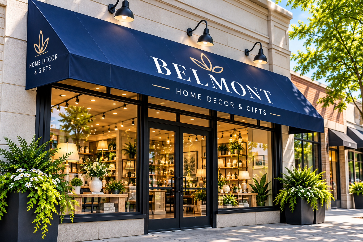
Your storefront is often the first interaction customers have with your business. Before someone enters your shop, restaurant, or office, they notice your signage, building appearance, and overall branding.
A professionally designed awning sign can improve storefront visibility, provide shade, and help customers recognize your business. However, poor design decisions can make even an attractive awning difficult to read or ineffective at communicating your brand.
From choosing the wrong colours to placing your business name in an awkward position, small mistakes can reduce the effectiveness of your commercial signage.
For businesses in Cambridge, Ontario, awning signs should also be designed with local weather conditions, building architecture, and viewing distances in mind.
In this guide, we’ll explore seven common awning sign design mistakes and explain how to avoid them when planning your storefront signage.
1. Choosing Colours With Poor Contrast
One of the most common awning sign design mistakes is selecting colours that look attractive together but make the text difficult to read.
For example, light grey lettering on a pale blue awning may appear elegant up close, but customers walking or driving past may struggle to recognize the business name.
Why colour contrast matters
Awning signs must communicate information quickly. When the background and lettering have similar brightness, the message can become less noticeable.
Poor contrast can also make signs harder to read in changing lighting conditions.
How to avoid this mistake
Choose colour combinations that provide strong contrast between the lettering and background.
Dark lettering on a light background or light lettering on a dark background often improves readability.
Brand colours are important, but visibility should remain a priority.
For businesses investing in custom awning signs in Cambridge, testing colour combinations before production can help create a more effective storefront design.
2. Using Fonts That Are Difficult to Read
Decorative fonts may look attractive in a logo, but they are not always suitable for commercial awning signs.
Highly stylized lettering, thin strokes, and tightly spaced characters can make business names difficult to recognize from a distance.
Why typography affects storefront visibility
Customers often have only a few seconds to identify a business while walking or driving past.
If the lettering is too complex, the sign may fail to communicate its message quickly.
How to avoid this mistake
Use clear, readable typography that suits your brand.
Avoid unnecessarily thin lettering, excessive decorative elements, and crowded text.
When possible, test the design at the approximate viewing distance customers will experience.
The goal is to create an awning sign that is attractive and easy to read.
3. Adding Too Much Information to the Awning
An awning sign should communicate your business identity clearly, not display every detail about your company.
Some businesses try to include their name, logo, phone number, website, services, slogan, and promotional offers on a single awning.
This can create visual clutter and make the most important information difficult to notice.
Why overcrowded designs fail
When too many elements compete for attention, customers may struggle to identify the main message.
A cluttered awning can also make a storefront appear less professional.
How to avoid this mistake
Prioritize essential information, such as your business name and recognizable logo.
Additional details can be displayed using window graphics, entrance signs, or other complementary signage.
Businesses planning a complete storefront upgrade can explore custom storefront signs in Cambridge to create a coordinated branding strategy.
4. Selecting the Wrong Awning Size
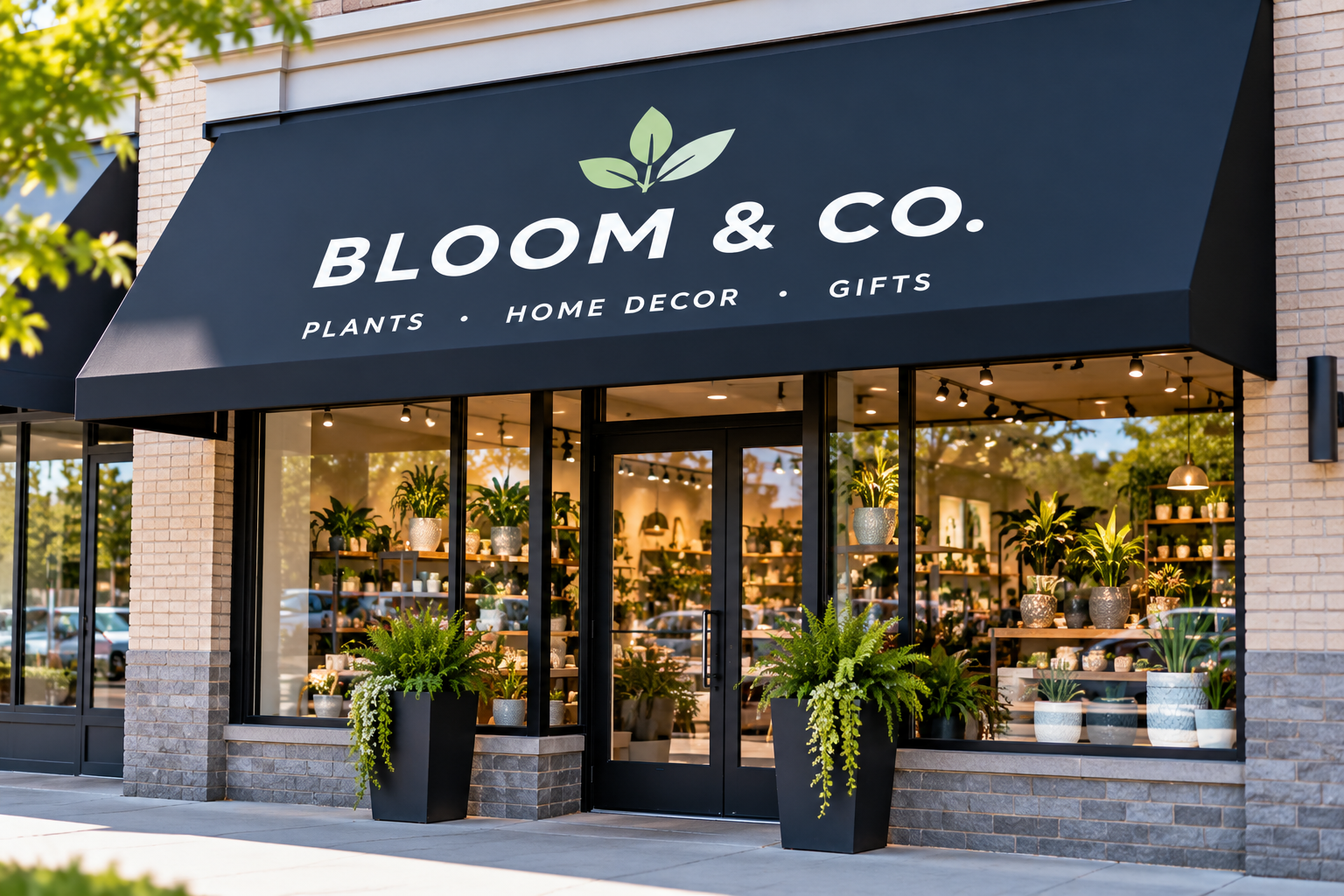
An awning that is too small may not provide enough space for readable branding, while an oversized awning can overwhelm the storefront.
Choosing the right dimensions is essential for both appearance and functionality.
Why awning size matters
The awning should complement the proportions of the building while providing adequate space for signage.
Its projection, height, width, and shape can all influence how easily customers see the business name.
How to avoid this mistake
Measure the storefront carefully and consider how the awning will appear from sidewalks, parking areas, and nearby roads.
Make sure the design provides enough space for readable lettering without overcrowding the front valance.
The final dimensions should also account for structural requirements, property restrictions, and applicable local regulations.
5. Ignoring Lighting and Visibility After Dark
A storefront may look attractive during the day but become difficult to identify in the evening.
Businesses that operate after sunset should consider how their awning signage will appear under low-light conditions.
Why lighting matters
Without suitable illumination, customers may have difficulty recognizing your business name after dark.
This is particularly important for restaurants, convenience stores, and other businesses with evening operating hours.
How to avoid this mistake
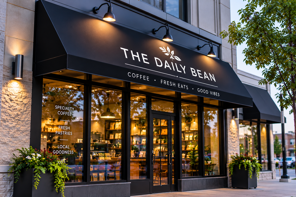
Consider appropriate exterior lighting or compatible illuminated signage.
Lighting should enhance readability without creating excessive glare or distracting nearby road users.
For businesses that need additional nighttime visibility, exterior signs in Cambridge can complement an awning sign and improve overall storefront identification.
6. Choosing Materials Without Considering Cambridge Weather
Cambridge experiences changing weather conditions throughout the year, including rain, snow, wind, summer sunlight, and freezing temperatures.
Selecting materials based only on appearance can lead to maintenance problems or premature deterioration.
Why material selection matters
Different awning fabrics, coatings, frames, and printing methods perform differently outdoors.
Poor material choices may result in fading, staining, wear, or damage under demanding conditions.
How to avoid this mistake
Choose commercial-grade materials suitable for the installation environment.
Consider UV resistance, moisture exposure, drainage, frame strength, and maintenance requirements.
Fabric awnings should use materials and structural systems appropriate for their intended use. Metal awnings should have suitable finishes and corrosion protection.
Professional planning helps ensure the awning’s appearance and performance are considered together.
7. Installing the Awning in the Wrong Position
Even a well-designed awning sign can be ineffective if it is installed in a location where customers cannot see it clearly.
Poor placement may cause the awning lettering to be hidden by architectural features, trees, or nearby structures.
Why installation position matters
The mounting height, angle, projection, and surrounding environment affect how customers view the sign.
An awning that looks good from directly in front of a store may be difficult to read from other approaches.
How to avoid this mistake
Evaluate the storefront from the most important customer viewing positions before finalizing the installation.
Consider pedestrian traffic, parking areas, entrance visibility, and nearby obstructions.
Ensure the proposed awning is compatible with the building structure and meets applicable municipal requirements.
Businesses planning exterior signage improvements can learn more about professional sign installation services.
How to Design an Effective Awning Sign for Your Business
Avoiding common mistakes is an important first step, but effective awning signage also requires a clear design strategy.
A successful commercial awning sign should combine readability, brand consistency, suitable materials, and thoughtful placement.
Keep the design simple
Focus on your business name, logo, and essential branding elements.
Avoid unnecessary graphics that distract from the main message.
Match the awning to your storefront
Choose colours, materials, and dimensions that complement the building’s architecture.
Consider customer viewing distance
Make sure the lettering is large enough to read from the locations where customers are most likely to approach.
Select materials for long-term use
Consider weather exposure, cleaning requirements, and the expected service life of the awning.
Plan for professional installation
Proper mounting and structural support are essential for safe, reliable performance.
By combining these elements, businesses can create awning signage that supports both storefront appearance and practical customer communication.
Why Awning Sign Design Matters for Cambridge Businesses
For restaurants, cafés, boutiques, retail stores, and professional offices, storefront visibility is an important part of customer recognition.
A well-designed awning sign can help people identify your location, recognize your branding, and find your entrance.
It can also complement other business signs to create a more consistent exterior appearance.
Businesses considering a broader branding update can explore custom signs in Cambridge to coordinate awning signage with their overall visual identity.
Frequently Asked Questions About Awning Sign Design
What makes an awning sign effective?
An effective awning sign uses readable lettering, strong colour contrast, appropriate dimensions, suitable materials, and placement that supports storefront visibility.
What colours work best for commercial awning signs?
High-contrast colour combinations are generally easier to read. The best colours depend on the business’s branding, building appearance, and lighting conditions.
Can I add my business logo to an awning sign?
Yes. Many commercial fabric awnings can incorporate printed logos, business names, and custom graphics.
Are fabric awning signs suitable for Cambridge weather?
Fabric awning signs can be suitable when the material, frame, and installation are designed for local weather exposure and applicable structural requirements.
Should awning signs be illuminated?
Illumination can be useful for businesses operating in the evening. Whether it is necessary depends on operating hours, ambient lighting, and local signage requirements.
Do I need a permit for an awning sign in Cambridge?
Permit requirements depend on the awning’s dimensions, structural attachment, location, and signage features. Check current City of Cambridge requirements before installation.
Create a More Visible Storefront With Signs Depot Cambridge
An awning sign should do more than display your business name. It should communicate your brand clearly, complement your storefront, and remain readable in the conditions your customers experience.
By avoiding common awning sign design mistakes, businesses can create more attractive and effective exterior signage.
At Signs Depot Cambridge, we provide custom business signage solutions for storefronts, commercial buildings, and retail properties.
Whether you’re planning a new awning sign or updating your existing storefront branding, explore our custom awning sign solutions or contact our team to discuss your project.
Contact Signs Depot Cambridge
Ready to improve your storefront visibility with professional awning signage? Contact Signs Depot Cambridge to discuss your custom sign design and installation requirements.
Signs Depot Cambridge
Phone: +1 (647) 763-9173
Email: info@signsdepot.com
Website: www.signsdepot-cambridge.com
Contact Page: Request a Quote